Designing a website that feels alive while keeping content front and center

Designer + developer
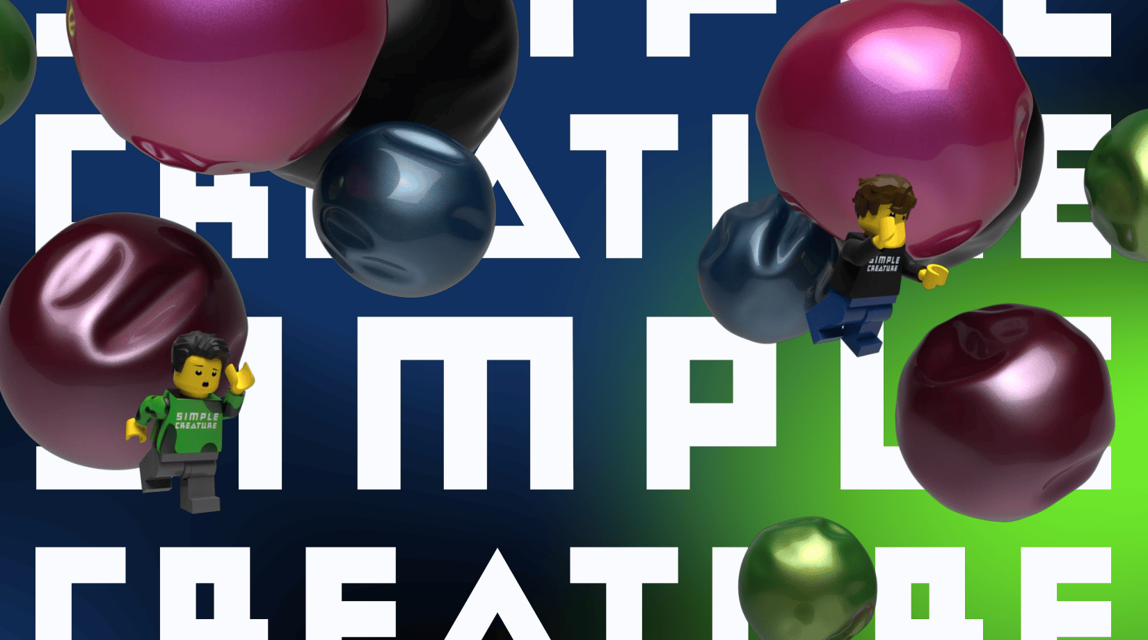
We recently launched the new website for Simple Creature, and throughout the process we challenged ourselves to create an experience that felt playful, tactile, and full of personality — while still keeping the focus on the work itself.
Although the site is primarily meant to showcase recent projects for our clients, we also saw it as an opportunity to experiment with interaction design and explore how motion can shape the feeling of navigating a website.
One of my favorite details is our “client constellation” — an interactive 3D environment built almost entirely with CSS 3D transforms, with GSAP ScrollTrigger handling the translation and rotation of the scene. The goal was to create something cinematic and dimensional without relying on WebGL or canvas rendering.
To help guide users through the site, we also developed a “scroll reveal” interaction that naturally introduces navigation options once the user reaches the end of a page. As the user scrolls past the content, the page container scales down to reveal the world underneath. The motion eases and rebounds slightly to create a soft, rubbery feel before snapping cleanly into place.
For the About page, we took a more playful approach to founder bios by building a miniature scene around our Lego avatars — complete with laptops, GPUs, coffee, and, most importantly... hacky sacks. The environment was modeled in Maxon Cinema4D and reconstructed in the browser using CSS 3D transforms and exported positional data. Subtle mouse-driven movement adds a layered parallax effect across the scene.
The Services page continues the idea of motion as navigation. A colorful pathway follows users down the page, while frosted glass panels subtly pick up and diffuse the surrounding colors to help visually connect the experience from section to section.
Projects like this are a balancing act between experimentation and usability.
We wanted the interactions to feel expressive and memorable without getting in the way of the content itself.