A brand and website for Queen City Development Group

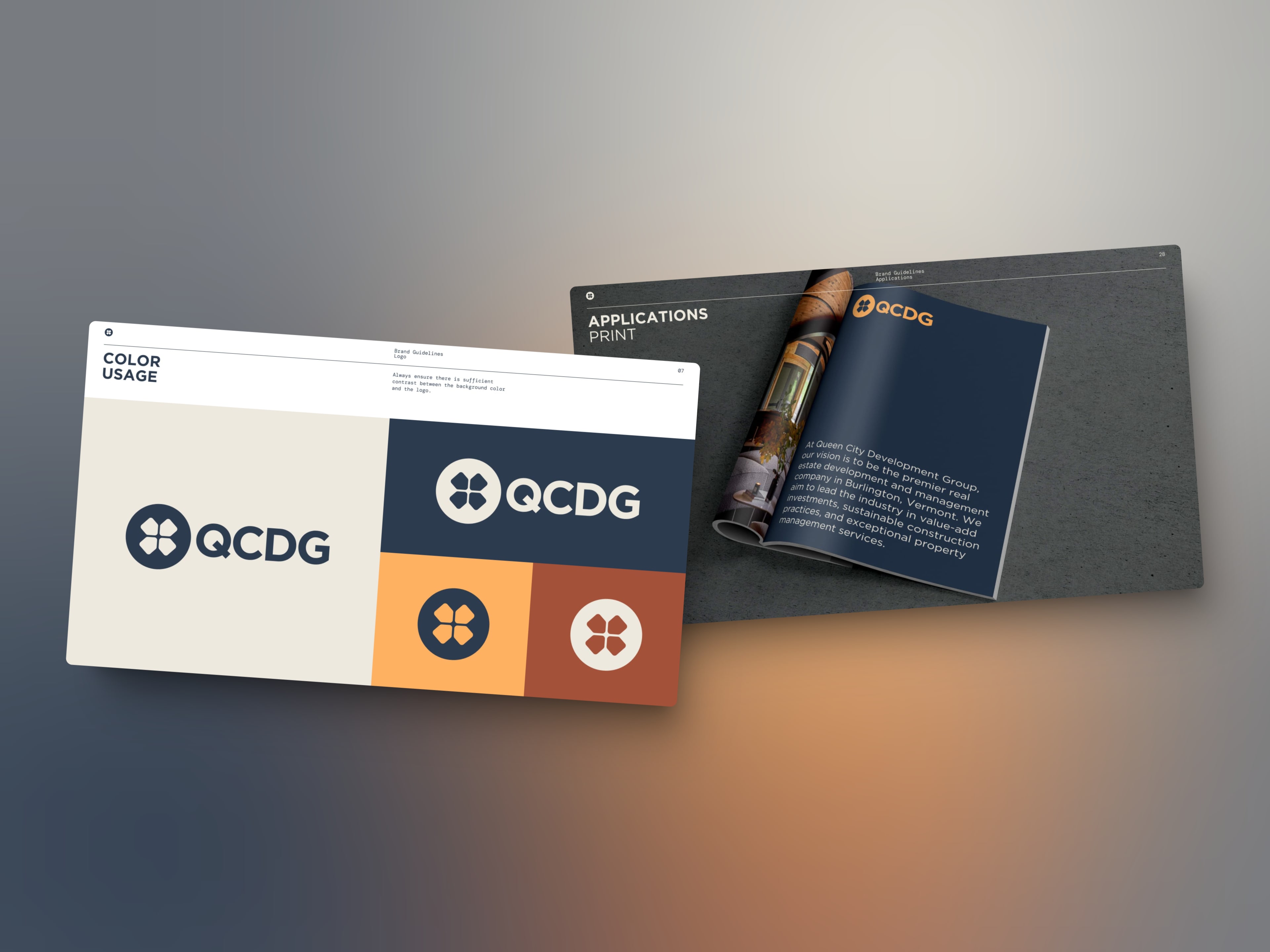
When Queen City Development Group approached us, they needed more than a website. They needed a brand identity that reflected their expertise in construction, design & development, investment and property management.
The brief covered three things: a new logo that captured their values and industry, brand guidelines to keep everything consistent, and a modern website to showcase their services and portfolio. All of it had to speak to investors, property owners and prospective clients alike, and feel professional without being stiff.
The brand
We started with the logo and brand guidelines before moving on to the website. The mark pairs a four-leaf clover set in a circle with a sturdy geometric wordmark. The guidelines set out a palette of navy, cream, orange and rust, a type system of Proxima Nova, DM Sans and DM Mono, and a tone of voice, giving every piece of marketing and communication the same foundation.
The website
The site carries the new identity through with clean layouts and a warm, neutral palette that conveys expertise and trust. Visitors can explore each of the four services in turn, and a portfolio section showcases completed projects with an emphasis on scope, quality and attention to detail. Testimonials, case studies and an About Us section build credibility.
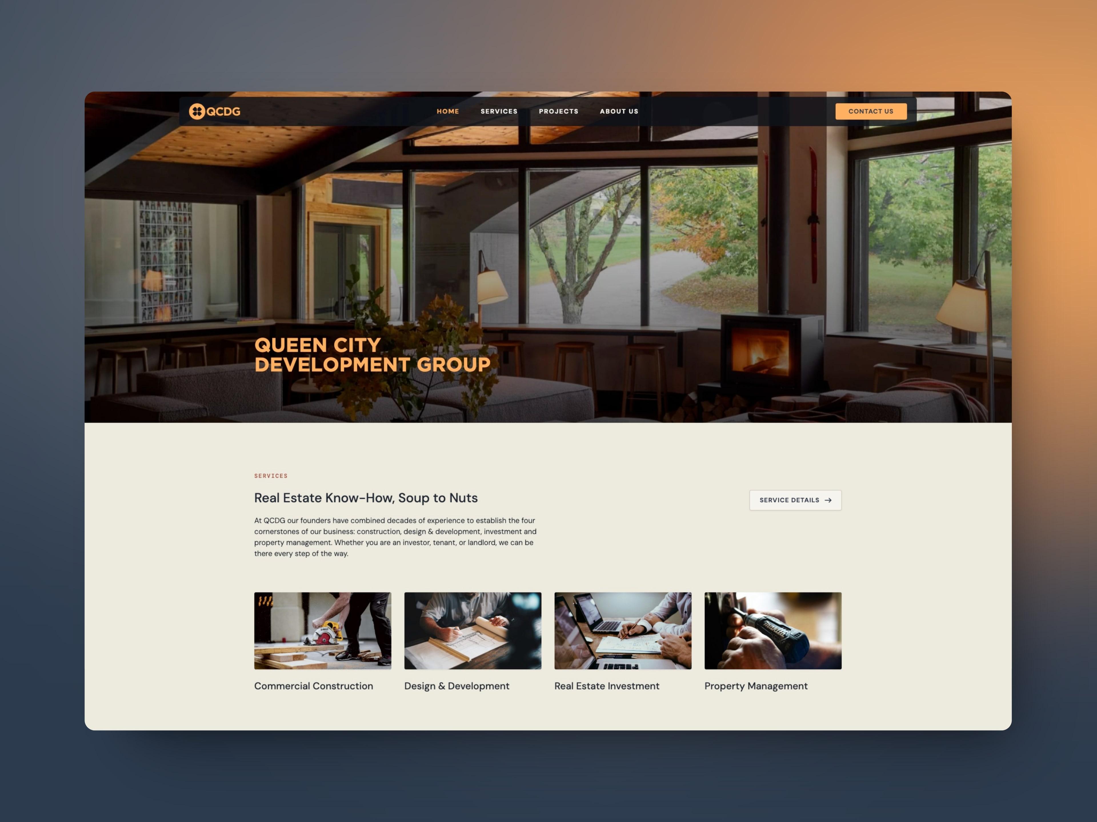
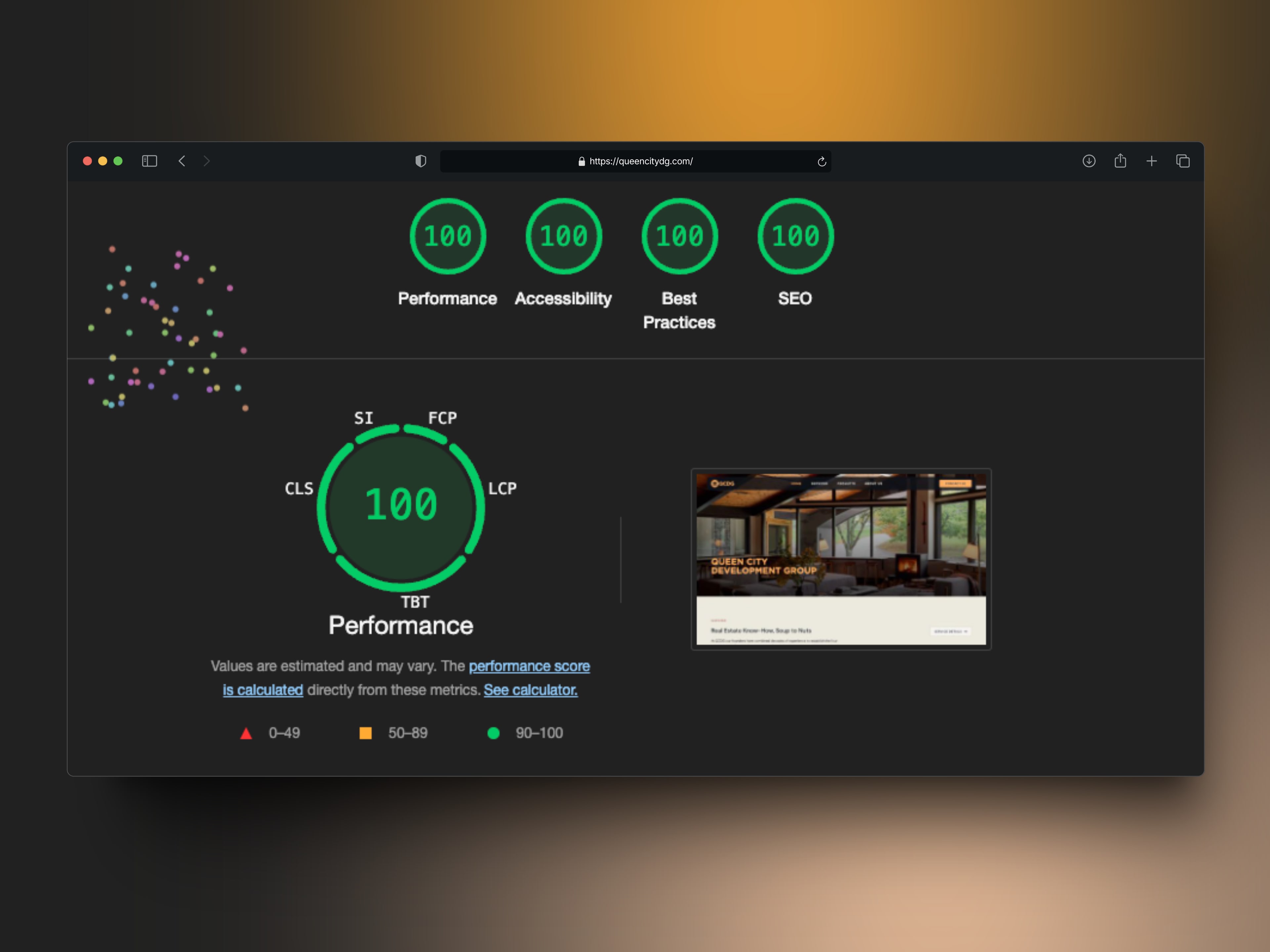
It’s fully responsive, fast-loading and built on a custom WordPress theme following SEO best practices, and it scores 100 across the board in Lighthouse.
The results
Together, the logo, brand guidelines and website position Queen City Development Group as a leader in their industry. Their online presence now shows the same quality and attention to detail as their projects, building credibility and bringing in new business.
Services provided
- Logo design
- Brand guidelines, including typography, color palette and tone of voice
- Website design, from the homepage through the services, projects and about pages
- Custom WordPress theme development, optimized for performance and search engines